One in 8 Million
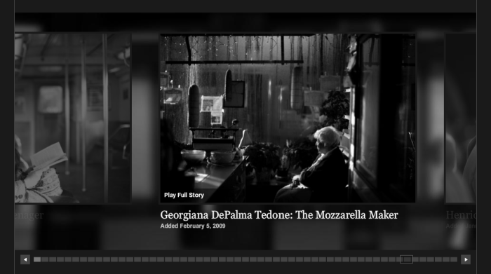
The One in 8 Million project of the New York Times introduces individuals living in New York City. Through sound and images, the project tells the stories behind ordinary people.
The characters are given a name based on their characteristics or story, like “the Mozzarela Maker.” In the “Series Index” drop down navigation, they are listed in alphabetic order of their last names. In the horizontal navigation bar, one’s character name shows up when users hover on one of those little boxes.
The navigation of the whole site is quite user friendly. There is a “Return to Collection” button on any interior page – either the multimedia page of an character, or the “About” pop-up page of the character. While the multimedia page stays clean, the “About” page gives users the choice of going to the next or previous character as well as “Return to Collection.” In “Series Index”, by eliminating box borders and a hover state effect, it reduces visual noise while it still defines each individual story.
“Link to This Story” is a good tool to help readers copy the URL easily and share the story, which in turn helps expand the audience of the project.
I think with the swiping sort of design, it is easy to be transfered to a mobile site.
Although it has got lively stories, it sticks with the black and grey tone, which seems a little too heavy.

This is a really neat project. But I agree with you about the black and white. I’d love to hear the reasoning behind it from the photographer and designer.
I also wish you could get to the About page from the Collection page. I tried to do that because I didn’t really want to listen to another story, but the option wasn’t there.
smorris88
December 2, 2011 at 9:30 am
I really liked the navigation for this site. I thought it was fairly intuitive, but it certainly didn’t dominate the page like it could easily have. I agree that the black and white is rather heavy, but it does contribute to the overall cleanliness of the site. However, that cleanliness borders on boring. A splash of color, even just on the photos, would have been nice.
Ashley
December 3, 2011 at 6:43 pm